
Dowling Duncan have submitted a design concept to a competition run by New York designer Richard Smith. The Dollar Bill ReDe$ign hopes to bring about change for everyone.
Why the size?
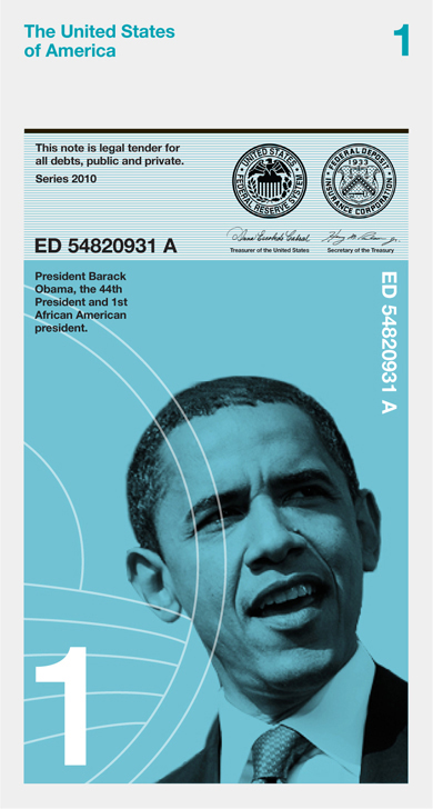
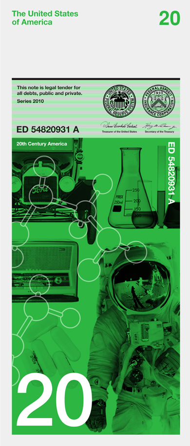
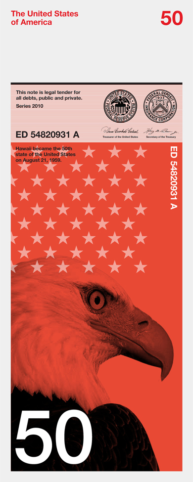
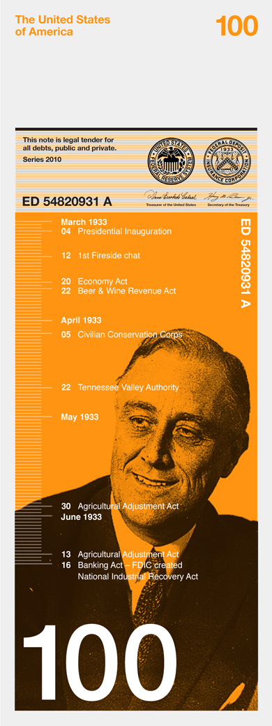
They have kept the width the same as existing dollars. However, the size of the note is changed so that the one dollar is the shortest and the 100 dollar the longest. When stacked on top of each other it is easy to see how much money you have. It also makes it easier for the visually impaired to distinguish between notes.

Why a vertical format?
People tend to deal with money vertically rather than horizontally. They tend to hold a wallet or purse vertically when searching for notes. A majority of people hand over notes vertically when making purchases. All machines accept notes vertically. Therefore a vertical note makes more sense.
Why different colours?
It is one of the strongest ways graphically to distinguish one note from another.
Why these designs?
Dowling Duncan wanted a concept behind the imagery so that the image directly relates to the value of each note. They also wanted the notes to be educational, not only for those living in America but visitors as well. Each note uses a black and white image depicting a particular aspect of American history and culture. They are then overprinted with informational graphics or a pattern relating to that image.


No comments:
Post a Comment